Modelling Infectious Disease Spread Through Random Graphs

Personal Note
With the recent spread of COVID-19, I’ve been hooked by the statistics that are being reported and trying to make sense out of them. It seems like the spread of viruses and other diseases are the perfect chaotic system for computers to handle (so much so that there is a dedicated field called computational epidemiology), and yet it seems like despite how well we understand virus spread, our response isn’t improving. In fact, without getting too deep into politics, one could argue that our response has worsened from SARS to H1N1 and now COVID-19. Nonetheless, I think there’s some value to be had in understanding the spread of diseases, even if it’s just to satisfy personal interest.
Introduction
I recently remembered an article I first read when the pandemic had just recently become big news in North America. It modeled the spread of a disease such as COVID-19 through collisions with balls in a box. It was such a simple illustration and model and yet it captured the chaotic nature of diseases. One errant ball moving a fraction of an angle in a different direction could change the direction of every ball in a matter of seconds. Such is the definition of a chaotic system. Granted, in reality diseases are non-deterministic (randomness in how viruses attach onto host cells, randomness in human behavior, etc.), but chaos is present in both systems. Alongside determinism, there were a few other issues present in the ball collision model. For one, it meant that every ball could be infected by the virus, even those who are still (in quarantine). Secondly, it implied that everyone in the box could directly infect everyone else so long as every ball is moving. While community spread is definitely prevalent, it is more likely (to what degree is unknown) that an individual infects someone within a certain group of family and close friends. It seems, then, that a solution to both problems is to use some sort of graph to model a social network. More specifically, a social connection should allow for virus transmission in both directions, and every node can be connected to another node by at most one edge for the case of simplicity (as we will later see). Thus, we want to model a social network off of a undirected simple graph.
Producing A Graph
This is a significant challenge. We want a graph that could feasibly represent a social network. We also want a graph that is randomly generated to reduce bias and ensure that the social network is nondeterministic. To create a random graph, the Erdős–Rényi model comes to mind. In short, for a given probability value p, there is a probability p that a node has an edge connecting to another node. This produces a binomial distribution of the number of edges coming from any one node, where the probability of a node having k edges is

Whether or not this is an accurate representation of social networks is beyond my limited expertise, so I consulted this paper titled "Random graph models of social networks" by sociologists Newman, Watts, and Strogatz. According to the paper, "it has been shown that the distribution of actor's degrees is highly skewed." The Erdős–Rényi model produces binomial distributions which are rather normal as N increases, contrary to real-life networks. To skew the degree distributions to the right (such that a few nodes have many edges), the researchers propose another algorithm by Molloy and Reed, more commonly known as the configuration model in network science. (see here for original paper). Suppose we have a probability distribution pk. Then, for every node, we assign k "stubs" to it such that k is drawn from pk. A stub is a guarantee of the existence of a future edge originating from a given node where the other vertex of the edge is currently unknown. We randomly pair all of these stubs and connect them with an edge. There are two potential issues with this model: self-looping and multi-edges. Self-looping occurs when a node is assigned more than one stub and two of those stubs are randomly paired, creating an edge that originates and terminates at the same node. Multi-edges occurs when two nodes each have more than one node and two or more randomly-generated edges form between those stubs, violating the rules of a simple graph. Fortunately, it can be shown that the number of self-loops and multi-edges remains constant for large values of N, meaning that the probability of a self-loop or multi-edge occuring approaches 0 as N approaches infinity. Since neither a self-loop or a multi-edge is relevant to examining disease spread, in my implementation, I simply removed these cases.
Note: A multi-edge could signify that two members of the population are closer, but if we choose to implement a multi-edge we would need to ensure that the incidence of multi-edges grows linearly with N, which means we would be unable to use the configuration model.
Indeed, the model itself does not skew the degree distribution since one could assign pk to be a binomial distribution, meaning that the random graph would be equivalent in distribution to the Erdős–Rényi model. What this model allows, however, is for the random graph to be a function of a predetermined pk, one that we can choose to be right skewed.
Finding a Degree Distribution
Newman, Watts, and Strogatz propose a power-law distribution function of the form:
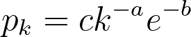
While a probability distribution of the sort would be the most accurate according to their research, it would necessitate 3 constants and the polylogarithm function. If we simplify by removing the exponential component (and still maintaining a power-law distribution), we would need to compute the Riemann-Zeta function. The CDF of this pk from arbitrary kmin to infinity must equal 1,
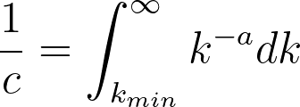
where
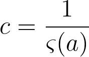
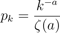
If k is treated as discrete, the above formulas describe a zeta distribution, which follows the power law and can be used to describe the probability distribution for our graph. To summarize, our probability distribution is of the form:
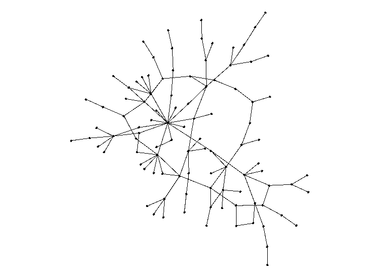
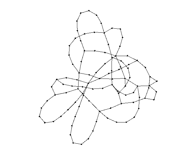
Now, for the fun part. Here is a random graph of 100 nodes with a = 3. Our actual simulations will run at a much higher number of nodes, so this is simply for the sake of visualization.
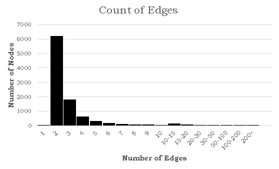
It's hard to tell from the image above whether the distribution of edges follows our power rule, but a histogram for the number of edges would allow for better analysis. Here's a histogram of the number of edges for each node when a = 2.5 and N = 1000:
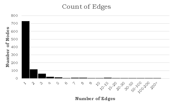
This distribution is clearly very similar to the probability distribution defined earlier. In this specific simulation, the maximum number of edges for a given node was 332, which seems abnormally high for a social network. While this is in fact true, there is a epidemiological concept of "super spreaders": people who transmit a given disease to far more people than the average person. For instance, one of the earliest COVID-19 spread cases came from a super-spreader who transmitted the virus to 53 people at just one choir practice in Washington state. That being said, the population of the United States is significantly larger than our simulation of 1000 nodes, suggesting that the probability of a super-spreader of this magnitude existing should be much smaller. There is also another issue in that 72.8% of the nodes have only one edge. If a node with one edge combines with another node of one edge, these will form a disjoint subgraph of size 1. The independent probability of this event occuring assuming N is sufficiently large is 53.0%. There are other patterns to generate disjoint subgraphs, but these are significantly less probable. Both of these problems (too many large superspreaders and too many single-degree nodes) can be solved by modifying a, but in opposite directions. We can reduce the size of superspreaders by increasing a, but doing so will also increase the number of single-degree nodes. To solve these problems, I turned away from existing models and tried tweaking several parameters. To reduce the size of super-spreaders, we take the square root of the degree randomly drawn from pk rounded upwards using the ceiling function. We can prove that the area under the CDF of this new function is still 1:
therefore
This does not solve the issue of the single-degree nodes, so we must increase kmin from 1 to 2. This simply causes a rightward shift in our edge distribution by 1 edge, leaving the shape, area and all other aspects of the curve intact. Here is a large (N = 10000) simulation of our final degree distribution at a = 1.5 (this value was chosen arbitrarily since it seemed to produce the best mixture of super-spreaders and k = kmin nodes):
Here is a random graph with N = 100 using the exact same degree distribution as the last histogram:
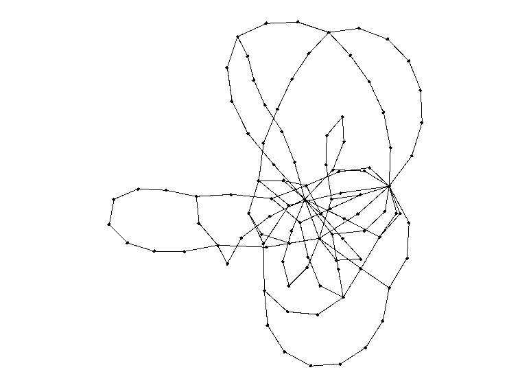
Interestingly, since kmin = 2 and the most common degree for a node is 2, there is a phenomenon of "looping" whereby several nodes of degree two join together creating a cyclic structure. There is not much to analyze about how this affects disease spread until we create and run a simulation, of course.
Structuring A Simulation
As a foreword, I will be structuring the simulation based on COVID-19, since it seems to be much more interesting to simulate an ongoing pandemic than it does one that occured in the past or one that never occured. The title of this project is about modelling disease in general, but most of the mathematically intensive work has already been done and can be generalized for any disease. Perhaps it's best to create a simulation chronologically, starting at patient zero. This is the first incidence of infection occuring on a human network, and we assume that there is a singular patient zero. Since patient zero is often infected as a result of animal-to-human virus mutation, it is unlikely that there are multiple patient zeros. Next, we define the virus lifecycle. After contracting the virus, a node first goes into an incubation period for 5 days. Studies show conflicting data on how long the incubation period for COVID-19 lasts, but a pooled study from public data (see here) shows that the median incubation period is 5.1 days. We avoid randomly distributing this as we would then need to make another assumption about how the incubation data is distributed, and making an incorrect assumption does more harm than ignoring randomness. Next, a node becomes infected for 14 days. Once again, we can choose to distribute this number randomly, but the distribution may be bimodal since the average recovery period for hospitalized patients seems to be much greater than the 14 days for non-hospitalized patients. Since 80% of the patients are not hospitalized, we assume that the average recovery time for all patients is equivalent to the average recovery time for non-hospitalized patients.
At this point, I feel like I should comment on these assumptions. Naturally, with a complex event such as a pandemic, there are bound to be multiple variables that influence the results. The very nature of simulations means that for the vast majority of these variables, we must assume, approximate, or infer from real world data. In an ideal world, I would assume every variable is independent and test them all individually, then in groups of 2, then 3 and so on. Unfortunately, the world is not ideal, and neither is your patience (I applaud you if you made it this far!). Thus, I must make somewhat educated guesses about which variables to keep constant and which to test, as well as what assumptions to make and avoid. This is not intended to be a scientific study or anything formal, so I might be cutting some corners.
Returning to the simulation, we see that there are a total of four states: healthy, incubating, infected, and recovered. For the purposes of a network, death is the equivalent of recovery since a recovery means that a patient can no longer contract or transmit a disease. Next, we define the two independent variables in our simulation: infection rate pinf and isolation rate piso. Every day that the simulation runs, there is a pinf chance that an incubating or infected node infects any healthy node it shares an edge with. If a infected node has 5 edges connecting to 5 healthy nodes, after 1 day there is a 1 - (1 - pinf)5 probability that at least one healthy node has been infected. Likewise, every day that the simulation is ran, there is a piso probability that an infected node (not including incubating nodes) quarantines, meaning that all edges connecting to that node are removed. The reason incubating nodes cannot be quarantined is because we assume quarantine is imposed as reactive measure instead of a preventative one. Since symptoms for COVID-19 begin after an incubation period, individuals in incubation can still infect others (as many studies have shown) without exhibiting the symptoms. With these definitions out of the way, we can begin simulating!
Constant Piso
Our first group of simulations are when piso remains constant. This would be a result of a society not reacting to the spread of a virus, meaning that the threshold for quarantining is never reduced, perhaps as a result of the virus not being discovered or simply a poor government response. Here is a visualization of 100 nodes before and after running a simulation of 25 days (pinf = 0.2, piso = 0.1):
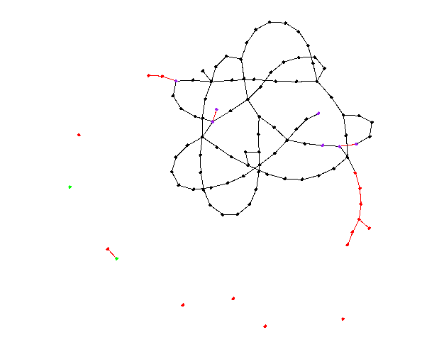
The purple nodes are in incubation, the red nodes are infected, and the green nodes are recovered. A red edge signifies the route the virus took. There appear to be 6 isolated nodes and 1 isolated pair that are caused by quarantining. Unfortunately, to reduce randomness bias we must increase N, meaning we will no longer be able to visualize our graphs, but instead the data they produce. Here is a graph depicting the spread of nodes among the four possible states as a function of time (N = 10000, pinf = 0.2, piso = 0.1):
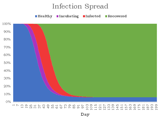
The results are rather bleak for humanity with just 579 nodes remaining healthy, giving the virus a 94.2% infection rate. The disease lasted for 152 days before every was either healthy or recovered, and the number of active cases peaked on day 42 when 6236 nodes or 62.4% of the population had the virus. The distribution is surprisingly smooth, and each state strictly follows a logistic curve, which is quite accurate given the current COVID-19 statistics. Next, I wanted to see how consistently these results occur given the amount of randomness in our simulations. I ran the same simulation 1000 times noting down the number of healthy nodes at the end of each simulation. There seems to be two clear classes of results: succesful propagation and containment. In 60 of the cases, the number of remaining healthy nodes varied between 9986 and 9999. the 61st highest number of healthy cases drops dramatically to 815. Removing these 60 "outliers", here is a histogram for the number of healthy nodes at the end of the each simulation:
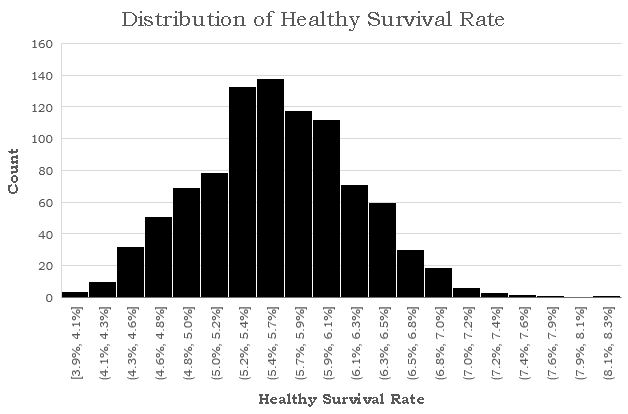
The mean healthy survival rate, which is defined as the percent of nodes which are never infected during the course of the simulation, is 5.6% with a standard deviation of just 0.6%. This suggests that the end of a simulation is relatively predictable given that we know whether the total number of cases ever surpasses a certain threshold t. I think that while seeing how the healthy survival rate is affected by changes to our two independent variables is interesting, it is rather obvious. Instead, I think a more interesting branch of study is seeing how this threshold changes, and seeing whether the spread of healthy survival rates ever becomes continuous for large N. Next, we run the same simulation at piso = 0.10 and pinf = 0.15. As expected, the mean survival rate tripled to 16%, but more interestingly, the number of contained infections increased from 60 to 170. Just by reducing the infection rate by 25%, the number of contained simulations nearly tripled. The threshhold for a successfully contained infection also decreased from 9986 to 9948, suggesting that it is both more likely for a disease to fizzle out when it becomes less transmissable and also the threshhold under which it can be contained widens. Now, we run the same simulation increasing piso to 0.15. The mean survival rate rose from 16% to 24%, suggesting that the the rate at which infected nodes are isolated is proportional to the healthy survival rate of the disease. The threshhold in fact did not decrease but slightly increased from 9948 to 9958, but the number of simulations which never crossed the threshold rose from 170 to 248, suggesting that the the isolation rate is proportional to the number of contained simulations. Since pinf seems to have a much greater impact on the proportion of contained simulations, I wanted to try one final simulation with pinf = 0.20 and piso = 0.20. Compared to our simulation with pinf = 0.20 and piso = 0.10, The number of contained simulations rose from 60 to 138 and the mean healthy survival rate rose from 5.6% to 12.8%. This informally reaffirms our hypothesis about the proportionality between isolation rate, healthy survival rate, and random containment rate although more simulations at a wider range would be required for more conclusive. results.
Linear Piso
For our second batch of simulations, we model piso as a linear function of time:
It makes sense that when a virus first enters a social network, there is little awareness about it and people tend to dismiss their symptoms as those of the common cold or flu. However, as it spreads, self and government-enforced quarantines become more vigilant. Once again, we will be maintaining that quarantine is not a precautionary measure, but instead a reactive one. Thus, only those currently infected can be quarantined. To reduce the number of independent variables, we choose a somewhat arbitrary po of 0.05 (a po of 0 would mean that no one who feels sick is quarantining, which seems unlikely given that people still quarantine for diseases like the common flu, albeit to a lesser degree.) Working backwards, we see that the average length of a simulation is around 150 days from our previous batch of simulations. Suppose at the end of the simulation that we want an average of 1 out of every 3 infected nodes to be quarantined every day. Then, the growth rate is 0.001889. We run 1000 simulations with these parameters: N = 10,000, pinf = 0.20, po = 0.05 , alpha = 0.001889). As a baseline, we compare these results to 1000 simulations using a constant piso of 0.15 and the same pinf. We can compare these two sets of data since the mean healthy survival rate for the linear piso is 9.34% while for the constant piso it is 9.29% (excluding data points that did not cross threshhold t).
There are two interesting differences that are noticeable from a surface-level analysis of the data sets. First, the standard deviation for the constant piso is 0.87% while for the linear piso it is 1.94%. Given that both means are sufficiently similar and the size of the data sets is sufficiently large, this difference between the two SDs can not be attributed to randomness alone and suggests that there is significantly more variation in the end result when piso is originally small and grows than when piso remains constant throughout. The second difference is in the number of contained simulations. When piso was held constant, there were 107 contained simulations compared to just 41 when piso is a linear function of time. This could be due to the poor containment caused by low values of piso(t) when t is small. With this new piece of information here's what we hypothesize about this "containment threshold":
- The distribution of healthy survival rates among a sufficiently large set of simulations is bimodal.
- When the number of infected nodes is sufficiently low, there is a chance the disease can be successfully contained due a combination of random quarantining and inability to propagate.
- For a set of values for pinf and piso, there exists some value for the number of active cases after which we predict that the disease will succesfully spread and that the healthy survival rate will be normally distributed around the lower mode.
- The number of cases which fail to exceed this threshold (called "contained simulations") is proportional to piso
- When piso is a function of time t, the number of contained simulations is more dependent on smaller values of t
Combining points 4 and 5 tells us that the number of contained simulations is proportional to piso for small values of t. I wish to expand on these ideas and see how the growth rate influences the normalized SD, (I would suspect that for a constant po a larger growth rate yields more variation in healthy survival rates, but in the interest of time, I will leave this as a thought exercise for now).
Contact Tracing
For our final batch of simulations, I'm interested in replicating the concept of "contact tracing", the strategy used to mitigate network spread by not only putting infected nodes in quarantine, but testing nodes with connected edges to see if they are infected and placing them in quarantine if they are. We employ a different sort of contact tracing in our simulation wherein we bypass testing and simply place all known connections in quarantine. The reason we do so is two-fold. For one, testing could take almost a week to get results back, meaning that quarantine at that point is significantly less effective. And second, in many regions of the world testing for COVID-19 was in short supply especially in the earlier stages of the epidemic, thus it would be unrealistic to test all known connections of every single isolated node. The reason I say "known connections" is because contact tracing isn't perfect, and there are bound to be interactions with people that have been unaccounted for or people that can't be reached by public health officials. Thus, we need to implement a new variable pcon which represents the probability of isolating a contact of an isolated node. Of course, a virus must first be discovered to begin contact tracing. In the case of COVID-19 this timeline remains unknown, but patient zero is suspected to have been infected on November 17th, 40 days before the virus had been discovered as novel. This value could be quite inaccurate but I can't think of a better way to determine at what stage of our simulation should be begin contact tracing. We run a simulation with linear piso where pcon begins taking effect after day 40 (N = 10000, po = 0.05, α = 0.0018889, pinf = 0.20, pcon = 0.8). Here is a graph of one simulation:
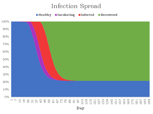
With just this graph, it's difficult to see how adding contact tracing and a linear piso changes the distribution of states, so I went ahead and overlayed this graph onto the earlier graph we made for constant piso:

Both graphs start off with nearly identical curves and for the first 40 or so days, they look like horizontal translations of one another. After around day 40, when the contact tracing comes into effect there is a noticeable flattening of the curve for this simulation. Another noticeable difference is that the tail end of infected cases is significantly shorter in this simulation versus the earlier one, presumably due to better quarantining procedures (higher piso and contact quarantining). Another interesting difference is that the virus lasted for only 107 days which is significantly shorter than any previous simulation I have done. Viruses with both constant and linear piso lasted for at least 130 days up to 160 days, so it appears that contact tracing is important in reducing virus length. I ran this exact same simulation 1000 times as I did with the other simulation batches. The number of contained simulations was 61, which is larger than the number of contained simulations without contact tracing but more data is required to make a conclusion whether this can be attributed to chance or not. The more interesting results are with the healthy survival rates. Ignoring the contained simulations, the average healthy survival rate is 26.45%, which is much greater than the average survival rate without contact tracing which was 9.34%. This makes sense: contact tracing increases the number of quarantined nodes which increases decreases the number of edges and reduces pathways for possible infection. What is more surprising, however, is that the standard deviation of healthy survival rates is 10.57%, which is much higher than the 1.94% without contact tracing and 0.87% without contact tracing and with constant piso. Even after normalization, the standard deviation for the healthy survival rates of this simulation is around 3.72%, which is a non-trivial difference.
We have seen this trend of increased variation now in both the linearization of piso and adding the contact tracing, both of which place the weight of quarantining to the latter parts of the disease (the former by increasing piso as a function of time and the latter by imposing the 40-day delay on contact tracing). Could this delay in quarantining increase variation? The idea seems counterintuitive. Isolation earlier should vause greater variation as a single quarantine could decide the fate of hundreds of nodes down the line. This is indeed true. Quarantining earlier causes much greater variation, so great in fact that it splits the distribution of healthy survival rates in two categories: successful propagation and containment. Isolation later on causes variation, but to a lesser degree and only targets simulations that have crossed the containment threshold. This is why when we exclude contained simulations, it appears as if the variation is higher when we delay quarantining.
This whole exploration of variation comes back to a central idea that contact tracing doesn't seem like a reliable way to succesfully contain an infectious disease (by our threshold definition). It's highly effective in reducing spread and increasing healthy survival rates, but unless contact tracing is invoked very early on or the infectivity of the disease is quite low, by the time contact tracing takes effect, the disease is already incubating in or has infected hundreds. From the data we've gathered, it seems like our best chance of increasing contained outbreaks is to increase piso, the rate of quarantining in the initial days. This means individuals self-quarantining when sick, even if it might just be a cold or a common flu. Of course this has challenges of it's own, but it seems like stemming the next pandemic before it erupts is up to the people.
A Look Ahead
In case, you are interested in running this simulation at home, I uploaded all my files to github. I really enjoyed working on this project and it was quite challenging at times. Obviously, I ended it shorter than I would have hoped so here's a hypothetical list of things I would have/thought of doing if I had more time:
- Used Newman, Watts, and Strogatz's proposed distribution. Evidently, I cut some corners using the zeta distribution, but I felt uncomfortable using polylogarithms since I frankly don't understand much about them.
- Increased N and modelled country / state borders. This would be like linking multiple randomly created graphs with a small amount of edges.
- See how shortest path / size of minimal spanning tree affect spread. This was something that I really wanted to do but I didn't know where I would fit it in. Admittedly, I was slightly afraid of doing the extra work only to find out there's no correlation.
- Given a graph and a very small subset of infected nodes, training a model to isolate a certain amount of nodes to minimize spread. This probably deserves a project of its own, and I'm seriously considering coming back to this.